WEB DESIGN
|
||
| www.townsvillefiredoors.com.au | ||
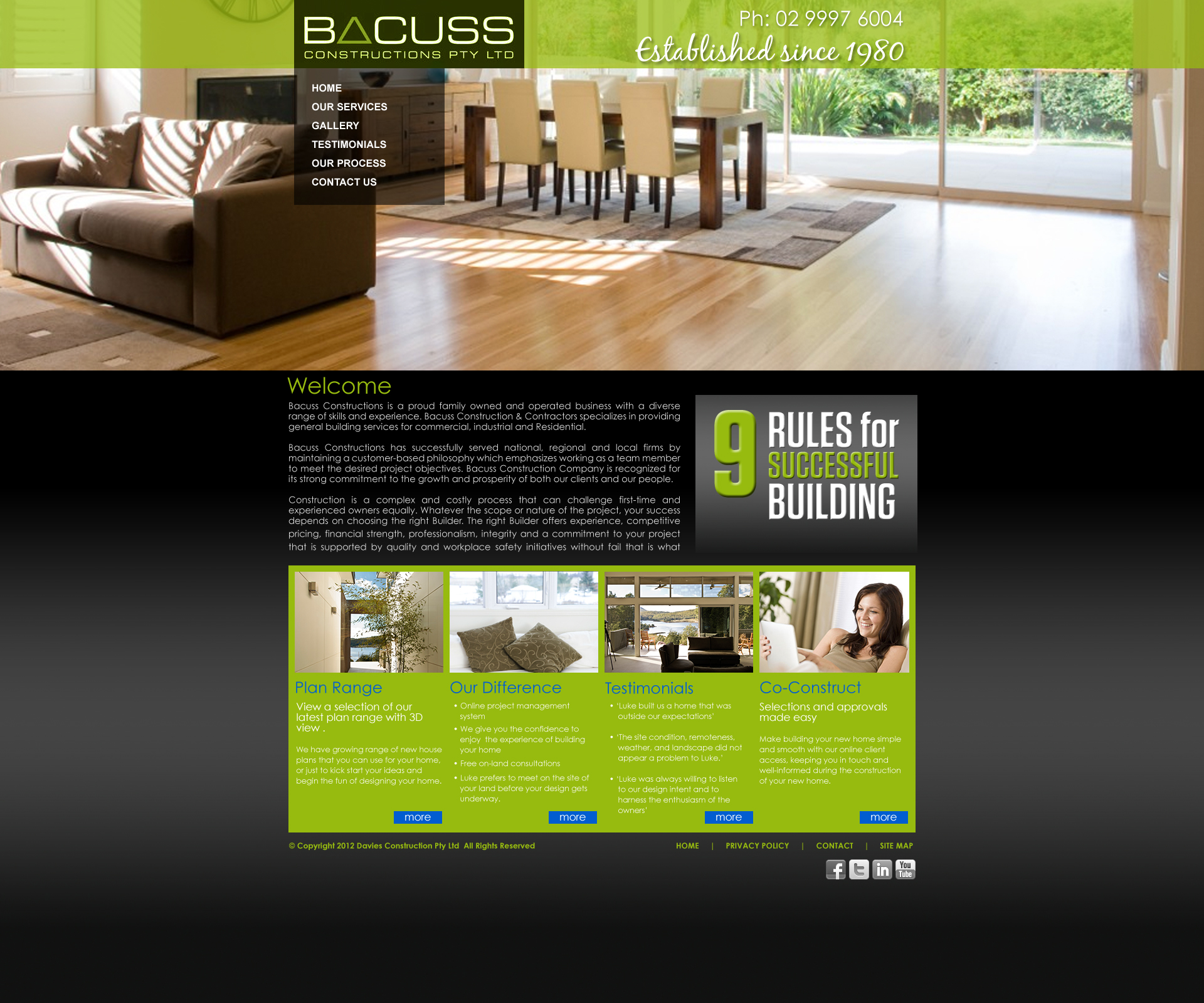
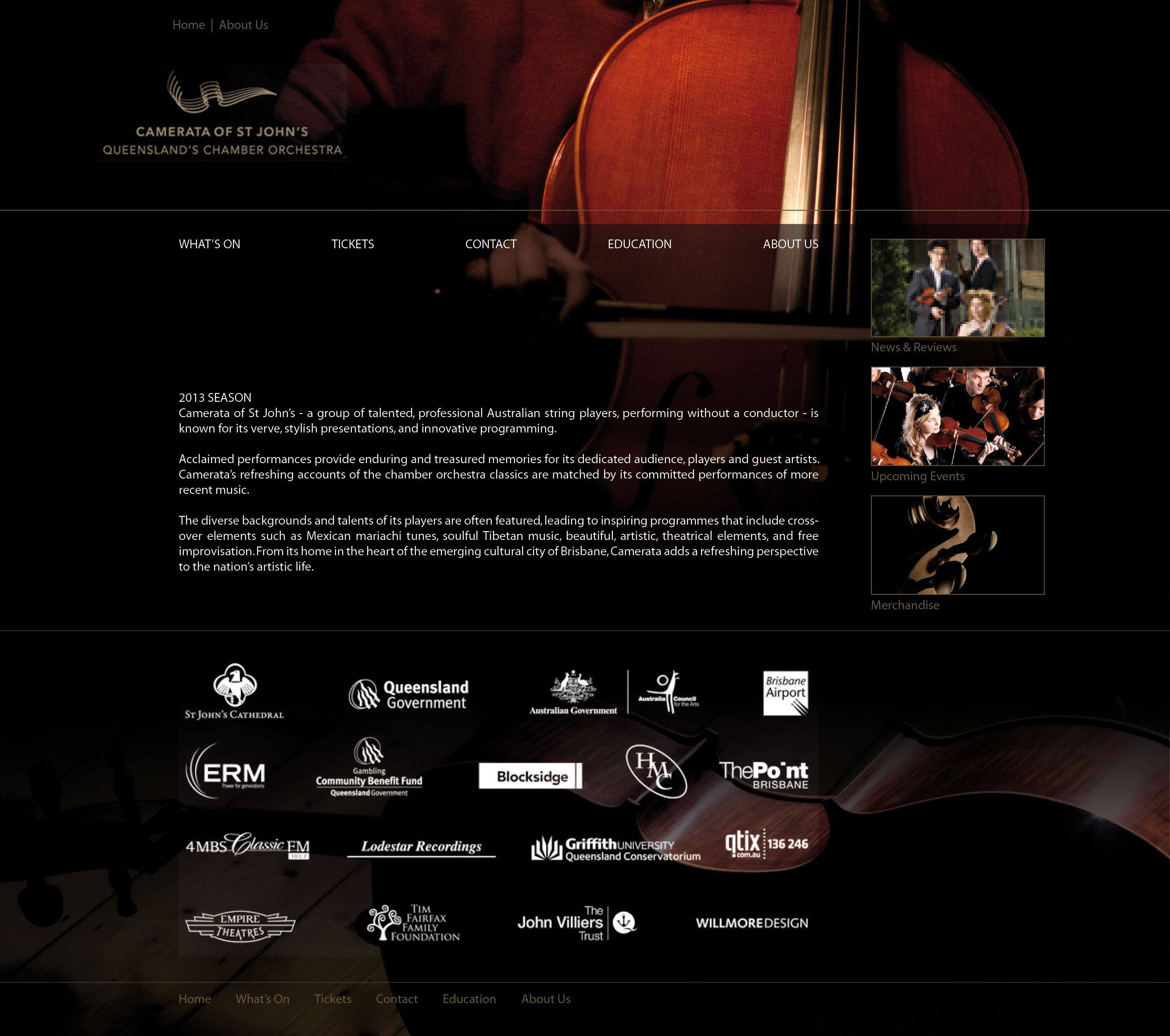
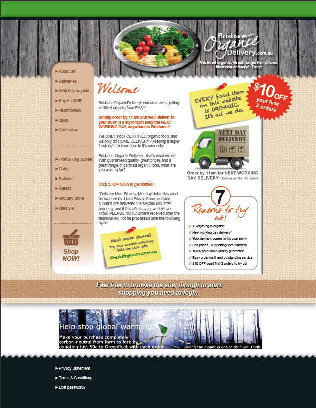
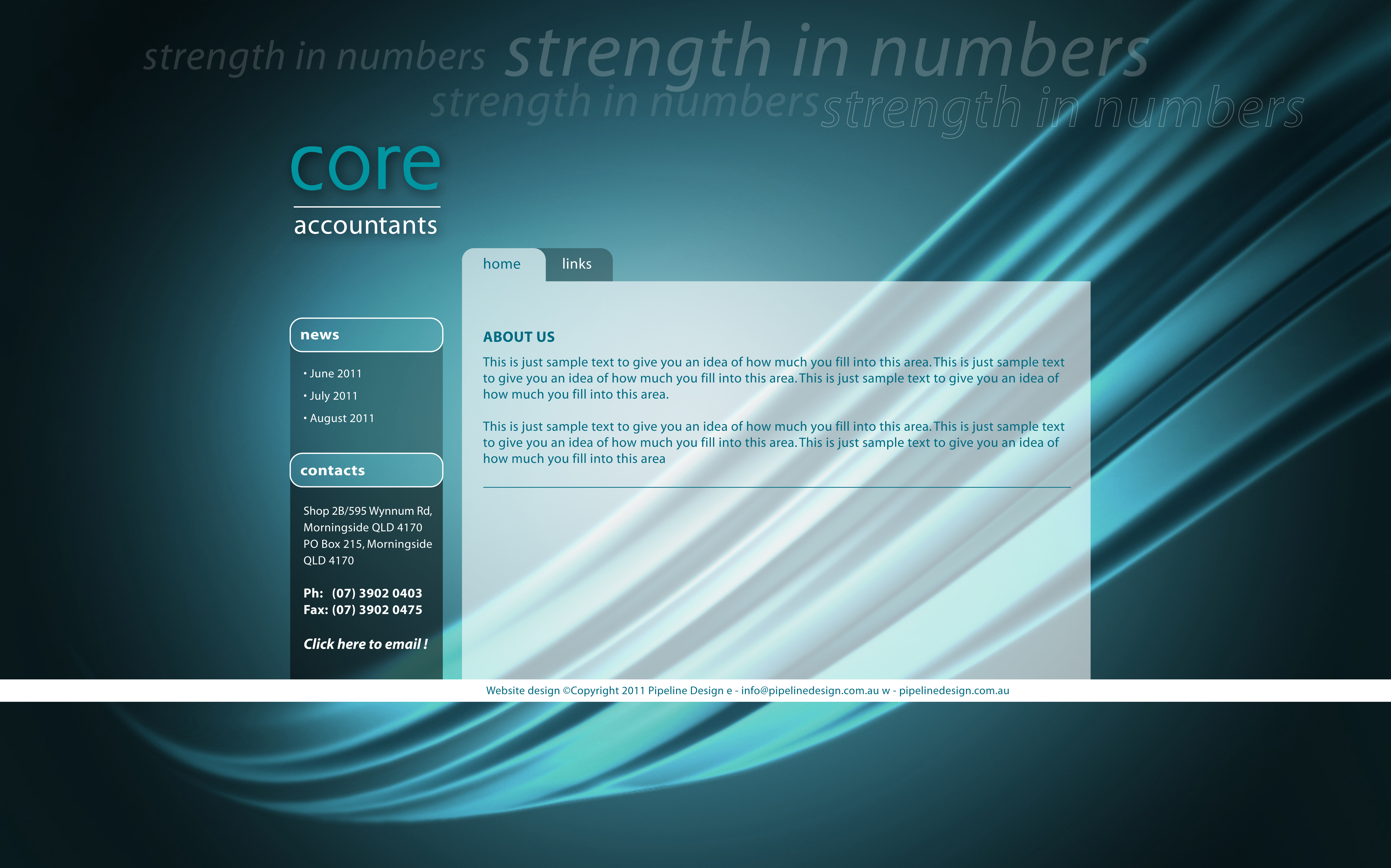
| Townsville Fire Doors has a new look! After years of looking at their tired old website Pipeline Design was approached to invigorate their look and give the site a new contemporary feel. Creating the site with a content management system and in conjuction with the ACRIS group we were able to give Townsville Fire Doors the flexibility to update and maintain thier own site. | ||
|
||
| www.stescoconstructions.com.au | ||
| Stesco Construction finally gave up the ghost on their old disfunctional website. The gallery didnt work and the pages just didn't flow properly. After a short consultation Pipeline Design was commissioned to revamp the site into a new functioning and easily managable site. Once again in conjunction with the ACRIS group Stesco Construction noe enjoy the functionality and flexibitly of a content managed site. | ||
|
||
| www.smithandgray.com.au | ||
| Brisbane based furniture makers Smith & Gray first approached Pipeline Design after not being happy with their original site. Voicing concerns about it not looking professional enough and the colour scheme just not gelling we were pleased to produce this slick new contemporay look form them. Featuring a gallery to show off their products and providing an all round better hosting solution for them. | ||
|
||
| www.onsource.com.au | ||
| Onsource had strong ideas on how their site needed to look. Pipeline Design was commissioned to polish those ideas and massage them into a creative solution that onSource were happy to pomote to their growing list of clientele. | ||
|
||
| www.fots.com.au.com.au | ||
| First time website owners FOTS Training had finally out grown their premisses and decided to develop their new site in conjunction to the completion of their new building. Pipeline Design was excited and proud to be part of this amazing growth developement for this company. The site features a fresh crsip and sharp blue and white colour scheme and features the FOTS Training logo, also developed by Pipeline Design. | ||
|
|
||
| www.ledscape.com.au | |||
| Ledscape Lighting is one of Australia's leading retail landscape lighting ranges. With stunnng visuals and product information this site was created under the direction of Ledscape's parent company Lumascape Lighting. | |||
|
||
| www.davkelautogroup.com.au | ||
Davkel Auto Group is soon to be one of Australia's leading car sales experts. When Pipeline Design was approach by Director Dave Cameron to produce the site we could hardly contain ourselves. Featuring modern strong colours that exude the confidence that you need to see in the car industry, the Davkel Auto Group site is a self managed content management site, giving the staff at Dvkel the freedom to update their own information at their leisure.
Also featuring on this site the Davkel Auto Group logo, developed by Pipeline Design. |
||
|
||
| www.cameronvehiclebrokers.com.au | ||
Sister site to Davkel Auto Group, David Cameron also commissioned Pipeline Design to produce the site for Cameron Vehicle Brokers. Using common elements, such as the blue banding from the Dvkel site, the websites are loosely linked together visually to maintain consistancy in branding whislt providing different services.
Also featuring on this site the CVB logo, developed by Pipeline Design. |
||
|
||
| www.macquariegrovehomes.com.au | ||
Macquarie Grove Homes were sick 'n' tired of their old clunk-it-ty clunk site and just wanted something new and uncluttered. Using the ACRIS CMS system Pipeline Design has created a clean minimalist site featuring a gallery page, testimonials page and a simple to follow navigation bar. No looking back now!
Also features ACRIS CMS backend. |
||
|
CONCEPTS UNDER CONSTRUCTION
|
||||||
 |
 |
 |
 |
||||
|
|
|
||
BOOK DESIGN
|
||||
| www.claim-it.com.au | ||||
Tyron Hyde is a Director at Washington Brown, one of Australia’s most respected quantity surveying companies, providing expert tax depreciation and cost-planning advice to property investors and developers across the country. Tyron is himself an active property investor. His passion and knowledge for the industry means that he is a regular media commentator and conference speaker on the subject.
Commissioned by Major Street Publishing this title was designed using strong contrasting colours and a bright white background to make the title pop.
Cover, internal design and layout by Pipeline Design Author: Tyron Hyde Publisher: Major Street Publishing
|
|
||
John Potter has had a stellar career in real estate and property development and puts his success down to his skills as a negotiator. John’s ability to negotiate winning deals is legendary amongst those he has worked with over the years.
Commissioned by Major Street Publishing this cover was designed to meet the brief of a diversified and varied portfolio. Using imagery to illustrate a wealth of experience and sublte confident colours to reassure the reader.
Cover, internal design and layout by Pipeline Design Author: Tyron Hyde Publisher: Major Street Publishing
|
||
|
||
| www.triangleofhealth.com.au | ||
A former IFBB Mr Australia and a man passionately dedicated to health and fitness for nearly three decades, Darren Vartikian offers a simple philosophy he believes will help maintain longevity for those committed to reaping the benefits offered by his Biomechanically Correct Training System.
Designed in elegant, strong black and featuring a stunning photgraphic visual this book is set to turn the health and fitness industry on its head. Contemporary, clean and easy internal design to read and fully illustrated examples for the reader to use for reference.
Cover, internal design and layout by Pipeline Design Author: Darren Vartikian Publisher: Triangle of Health Publishing |
||
|
|
||
| wiley.com | |||
This incredible title is renowned throughout the United States and Australia. Pipeline Design was incredibly honoured to be involved in this high profile project. The cover design was supplied by the Author and Publisher, however the challenge was set to created a matching internal design for a pre-existing cover.
I'm glad to say Pipeline Design rose to the challenge. Using gorgeous ocre reds and subtle caramels this inviting and visually stunning 4 colour internals stole the show. This is agreat feather in our cap and we here at Pipeline could not be prouder of the result.
Internal design by Pipeline Design Author: Mary Anne Bennie Publisher: Wrightbooks |
|||
|
COVER DESIGN
|
||||||
 |
 |
 |
 |
||||
Cover design: Pipeline Design Publisher: Pi Publishing
Website: www.stevemcknight.com
|
Cover design: Pipeline Design Publisher: Major Street Publishing
Website: www.margaretlomas.com.au
|
Cover design: Pipeline Design Publisher: Michael Hanrahan Publishing
|
Cover design: Pipeline Design Publisher: Michael Hanrahan Publishing
Website: N/A |
||||
|
|
|
||
PRINT DESIGN
|
||||
| www.nlgleasing.com.au | ||||
Working with John Grant Director & CIO of NLG Leasing, Pipeline Design was challenged to design this 6 page gate fold brochure. As a requirement of the brieif the design had to appeal typically to customers and businesses that often hire or lease vehicles. Additionally the brochure had to compliement the brand and reinforce strong ties to the website and coporate image.
Also features the NLG Leasing logo, designed be Pipeline Design
|
|
||
| www.wrappedcafe.com | ||
Wrapped cafe situated in Edward Street the city approached Pipeline Design to create these fresh, clean menu posters. Using bright spring colours, lime green and orange, the brief was to produce a look that promoted a healthy choice plus envoke an feeling cooling refreshment. Who's thirsty?
Also feature here the Wrapped Cafe logo, designed be Pipeline Design |
||
|
||
| www.rail-reg.gov.uk | ||
The Office of Rail Regulation Annual Report was designed to suit their corporate identity. Using crisp white and a confident navy blue the report brief was to exemplify trustworthyness and reliability to their shareholders and customers.
Printed on uncosted matt stock and snow white uncoated internal paper resulted in bright impactive colour images and easy to read elegent text. eas |
||
|
||
Wanting to stand out from the crowd Slaney Welding asked Pipeline Design to develop their logo and Company Profile. Using stark black and an bright contrasting green resulted in a highly visual and effective piece. The Logo primarily based on the companies intials features a simple break in the letters representing a welding arc. |
||
|
|
|||
LOGO DESIGN
|
||||
looking for simplicity and elegance Amuri's cafe were after something different to the normal cafe style logo design. Using the owners wife's name the cafe was called Amuri's and the requirement of the brief was to use red. Translated into sinage, letterhead and all round corporate image the logo was developed to be print in red or reversed out white in a red box.
|
|
||
| www.cameronvehiclebrokers.com.au | ||
Under construction.
|
||
|
||
| www.devkelautogroup.com.au | ||
Under construction.
|
||
|
||
| www.nlgleasing.com.au | ||
Under construction. |
||
|
||
Under construction.
|
||
|
||
| www.fots.com.au.com.au | ||
Under construction.
|
||
|
||
| www.wrappedcafe.com | ||
Under construction.
|
||
|
||
Under construction.
|
||
|
|
|
||
|
||||
|